Tuesday, 15 November 2011
brainstorm
i have choosen 3 words from my brainstorm PRESENTS, CHRISTMAS PUDDING AND HOLLY i am going to design limited edition bottle designs for christmas
Review of my research
As i am going along with my research i have found out that Coca-cola have used different types of advertising and use only one style. So my aim is to design something that will fit in their criteria and go with their image.
Different drinks brand
These are some of the different drinks brand the reason for researching this is so it will help me understand different brands and have an open mind of the brand i have chosen to research.
Random Poster designs
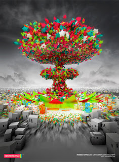
These are just some random Poster designs i have come across which i thought looked very interesting and would inspire me to develop my own designs i like different aspects of the illustrations and i think if i combine few of my ideas i could come up with a design that will fit the image of the brand Coca-cola
Monday, 14 November 2011
Andy Warhol
I really like this piece of work from the artist Andy Warhol i like the fact that this piece looks as its done by screen print each time he has used a different colour combnations. This is the type of work i would like to experiment in my own designs and see if it works well with the brand i have choosen.
This illustration is really plain as it only consists of the colours black and white but then again its really effective as the coke bottle stands out and the colours make the design look classy, so illustrations and designs don't need to be very complicated to get the message across.
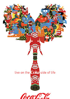
This is one of my favourite piece of work as i really love the way it looks its really vibrant and it stands out i like the way it ties in to the 21st century and also the way the design has been reflected to look identicle on each side this again is inspiring me to design a piece of work similar to this so i could mirror it so both of the design aspects look identicle
This is something that caught my eye i like the style of the design. the images on this design work very well together this reminds me of the pop era.
Experience The Great Happyfication
This is one of the videos of Coca-cola i really like the reason being is i like how this video consists of animated characters also i like how its cartoon like and its really interesting to watch this video relates to the target audience of this product as everyone will enjoy watching it.
Coca Cola Christmas Commercial old
The reason i have looked into christmas advertisements that Coca-cola have produced is i am thinking of designing a advertisement for christmas i love the fact that this product protrays that this drink brings the family togather also the fact that the holidays are coming so drink coke and celebrate.
A little history about Pepsi
Pepsi was first introduced as "Brad's Drink" in New Bern, North Carolina, United States, in 1898 by Caleb Bradham, who made it at his home where the drink was sold. It was later labeled Pepsi Cola, named after the digestive enzyme pepsin and kola nuts used in the recipe.[2] Bradham sought to create a fountain drink that was delicious and would aid in digestion and boost energy.[3]
In 1903, Bradham moved the bottling of Pepsi-Cola from his drugstore to a rented warehouse. That year, Bradham sold 7,968 gallons of syrup. The next year, Pepsi was sold in six-ounce bottles, and sales increased to 19,848 gallons. In 1909, automobile race pioneer Barney Oldfieldwas the first celebrity to endorse Pepsi-Cola, describing it as "A bully drink...refreshing, invigorating, a fine bracer before a race." The advertising theme "Delicious and Healthful" was then used over the next two decades.[4] In 1926, Pepsi received its first logo redesign since the original design of 1905. In 1929, the logo was changed again.
In 1931, at the depth of the Great Depression, the Pepsi-Cola Company entered bankruptcy - in large part due to financial losses incurred by speculating on wildly fluctuating sugar prices as a result of World War I. Assets were sold and Roy C. Megargel bought the Pepsi trademark.[5]Eight years later, the company went bankrupt again. Pepsi's assets were then purchased byCharles Guth, the President of Loft Inc. Loft was a candy manufacturer with retail stores that contained soda fountains. He sought to replace Coca-Cola at his stores' fountains after Coke refused to give him a discount on syrup. Guth then had Loft's chemists reformulate the Pepsi-Cola syrup formula.
On three separate occasions between 1922 and 1933, the Coca-Cola Company was offered the opportunity to purchase the Pepsi-Cola company, and it declined on each occasion.[6]
Main Competitors
Pepsi is the main competitor of coke i really like this illustration as it shows the two can are having a boxing match i think the message is very clear that they are in competition
Advertisements Coca-cola
This Coca-Cola advertisement from 1943 is still displayed in the small city of Minden, Louisiana.
The message in this advertisement is 'A classic never goes out of style' the way they have designed this advertisements with all the classsic music artists works really well as coke is a classic drink and it wont go out of style the images go really well with the design of the coke bottle

This design is very vibrant the colours that have been used caught my eye so i decided to add this to my research i like the way that all things that make you happy are coming out of the top of the bottle and all the images put togather form the shape of a heart this is very effective, I also like the slogan they have used 'The coke side of life'.
This design reminds me of the olden days the reason for this is it looks old and vintage as it has been photographed on a wooden chopping board with fruits and cheese around it, The only thing that really stands out is the brand it also portrays that this drink is a classic and it goes well with everything.
Subscribe to:
Comments (Atom)


