I really like this piece of work from the artist Andy Warhol i like the fact that this piece looks as its done by screen print each time he has used a different colour combnations. This is the type of work i would like to experiment in my own designs and see if it works well with the brand i have choosen.
This illustration is really plain as it only consists of the colours black and white but then again its really effective as the coke bottle stands out and the colours make the design look classy, so illustrations and designs don't need to be very complicated to get the message across.
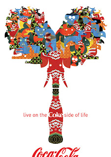
This is one of my favourite piece of work as i really love the way it looks its really vibrant and it stands out i like the way it ties in to the 21st century and also the way the design has been reflected to look identicle on each side this again is inspiring me to design a piece of work similar to this so i could mirror it so both of the design aspects look identicle
This is something that caught my eye i like the style of the design. the images on this design work very well together this reminds me of the pop era.


No comments:
Post a Comment